Independent Project Intentions Form

Which of the words given in the brief document have you selected, and why?


Division.

Because in this day and age I feel the majority of people are divided in some way, and while others view this quite pessimistically (rightfully so in certain instances), I feel like there can still be beauty in division. Such as where landmass meets ocean. A natural division, and a large one, but still engrossingly gorgeous and awe-inspiring. While my photography will certainly not reach these spectacular heights, I hope it at least will make people consider my point of view.

What do you want to point your camera at?


People.

People are fascinating, amazing, ridiculously complicated creatures and quite frankly I find a lot of what we do confusing, which is more than enough reason for me to want to base some photographic work around us and our escapades.

Specifically, I would like to create a series of triptych pieces featuring our many “selves”, the physiological theory that we present ourselves differently depending on social context (I shall expand on this later in the proposal).

The centrepiece, a bland, benign, completely unremarkable portrait in the style of a passport photograph. Your most neutral, polished, “socially acceptable” self.

The left, a portrait in the style of a Facebook profile picture. Personalised to the subject, informal, yet still projecting a “self” that they would like others to judge them on at first glance. Be that provocative, mature, or charming.

The right, in the style of a self portrait that might be sent over Snapchat to a friend. Personal, totally informal, and the majority of the time projecting only the self that is shared with the close, and intimate of relations.

Why are you interested in this subject?


I didn’t think I was until I read “The Selfies: Social Identities in the Digital Age” by Crisia Miroiu, an academic essay assigned as essential reading during our week six seminar.

In essence, the essay discusses the varying ways that the proliferation of digital technology, be it social media, camera phones, or internet enabled webcams, have affected the way that people present themselves to others in a much larger way than they did before.  It was only while doing this reading that I realised precisely how much of a conscious effort I made to present myself on my various social media platforms.

On Facebook, the place where I have the most family and business contacts, my profile pictures in recent years have either reflected myself as a professional or something to support my online “brand”[1] (such as having a piece of character portraiture I took for a short film representing me).

On Twitter, I present myself in a much more relaxed way, but I still recognise that it is a public face for my “brand”, therefore my profile pictures vary between cheeky and relaxed, but measured and controlled photographs of myself, to stills from my various short films.

Meanwhile, on Snapchat, a place that I am entirely confined to interacting with good friends, I have a completely no-holds-barred attitude to the way I’m presented. I am reasonably unrestricted in my portrayal of myself, and of others, because the odds are that whomever I am sharing a particular image with has seen me in such a state or worse on previous occasion.

Upon reflecting on this, I became fascinated with the idea of comparing those kinds of images, to the images where we are presenting the most neutral, socially acceptable state of ourselves. Thus, the concept was born.

[1] I own and operate a Youtube channel with approximately 2,000 subscribers.

What do you hope an audience will take from your images?


If I manage to make them think in any way like I was after reading Miroiu’s essay, I’ll consider the project a complete and total success.

If not, and they just have fun looking at a series of images of people pulling amusing faces, I’ll consider the project a complete and total success.

No matter how people view the project, be it through academic eyes, or as a casual observer, my job as a photographer in portraying something through my imagery will have been done and I will be happy.

What areas of research are you considering to help deepen your understanding of the subject you have chosen?


Largely, I’ll be performing my own primary research with a group of my peers. Interviewing similarly aged social media users to find out specifics about how they present themselves online.

Each of my triptych images will be directed almost entirely by the subject, I won’t be posing them how I like, I will be asking them to pose how they would in that given situation. Naturally, I would be naive to think that the subjects will be as comfortable with me, a photographer pointing a comparatively camera at them, as they would be with the self-controlled lens of their camera phone, so building a quick rapport through small vox pop sessions will be incredibly valuable to the final outcome of my project.

Otherwise, the only research I am particularly leaning on is the original writings outlined in Miroiu’s essay. References such as William James theory of self, and sociologist Charles Horton Cooley’s concept of the “looking glass self” are being delved into and analysed for points that might be valuable to broaden my point of view.

What practitioner(s) or visual resources would you consider to have influenced you? This not have to be photographic.


I don’t feel like I was really influenced by anybody in particular. However, whether consciously or not, I do recall a photographer being mentioned during one of our lectures that produced a series of images designed to emulate passport photography in incredibly high quality, and I am of course doing something similar.

What support or equipment might you need to achieve your goals?


Only guidance in the best lenses to use for any given portrait, and possibly aid in setting up the radio controlled flash kits in the photography studio.

I have yet to decide whether or not the photography studio will be my primary shooting location, as I do adore street photography, especially well done street portraiture. However, I don’t feel I would be able to build up the  rapport with general members of the public quickly enough to get results I would be happy with.

As previously mentioned, support from my peers in my research is required to some extent, but I have complete confidence in myself and them in that regard.


Studio Portraiture Workshop

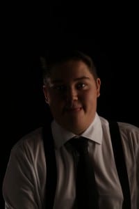
During our Week 6 photography workshop we put into practice everything we’d learned about portraiture over the prior week of lectures. We were asked to dress as our alter egos, something that was very heavily outlined in that weeks seminar reading, ‘The Selfies: Social Identities in the Digital Age,’ by Crisia Miroiu, that in essence discusses the theory that every person presents themselves differently based on their situation, and with the rise of social media, we have even more “selves” that we present to others, and our actions during the workshop would work to support that.

Baring this in mind, I chose to dress rather dashingly (going so far as to borrow hairspray from an ever patient flatmate), and then milk the everliving heck out of it for the duration of the workshop.

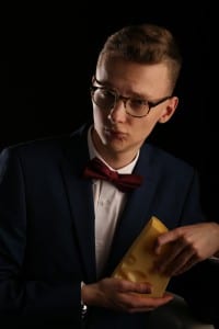
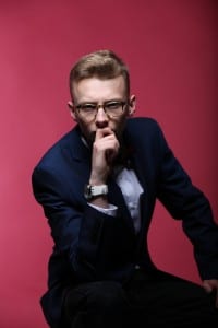
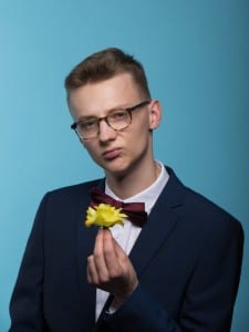
These are just a few of the images taken of me during the workshop.

IMG_2168
Suave With Cheese (Photo Credit: Dave Humphrey)
IMG_1129
Pondering Frowningly (Photo Credit: Natasha McLellan)
Bowtie_Smoulder_4
Bowtie Pout w/ Yellow Flower (Photo Credit: Dave Humphrey)


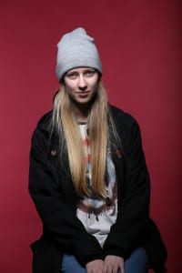
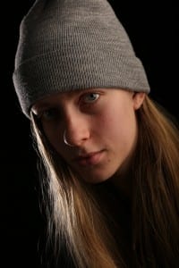
And now, while much less dashing, some equally interesting portraits that I personally took.

IMG_1144 IMG_2115 IMG_2150

I found this workshop to be incredibly valuable to me for several reasons. Primarily, I would like to focus on portraiture for my final project, and this was great practice and really gave me perspective on one key aspect of the genre: shooting in a studio.

While my final photographs will almost certainly end up being shot outside on the fly, with minimal to no control over the lighting aside from a reflector, this experience was invaluable particularly in relation to the use of radio synchronised flash, the use of appropriate (and perhaps a couple fun but inappropriate) lenses, and putting into practice everything we learnt during the still life coursework on a much larger scale.

I look forward to taking these skills and applying them to my final project.


Still Life Photography

As part of our photography coursework, we were asked to shoot some still life photographs and put into practice skills we learned in our workshop sessions. We were given fairly free reign to shoot whatever we wanted, however the object must’ve been found. Be it on the street, in a flatmates cupboard, or tucked away in a suspicious looking hollowed-out brick down one of Lincoln’s many shadowy passages.

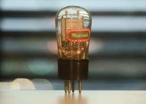
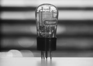
Here is my final photograph.

Still_Life-1
Still_Life-2 Marconi Radio Tube (Colour and B&W Variants)

You may notice there are two images, this is because I couldn’t decide which edit I preferred, and they are technically one photograph, so I count it. They each have their merits, and I shall expand on this later in the post.

I chose to shoot this, which I found in an obsolete technology shop halfway up Steep Hill. This is a radio tube, sometimes known as a vacuum tube, which were the precursor to transistors, which in turn were precursor to silicon chips, which are in every confusing electrical device that you own that might appear to run on magic (including the device that you’re reading this on!).

I chose it because, quite frankly, I think they’re beautiful both in form and in function.

They are the grandfather of modern tech, invented in 1902, and are surprisingly still utilised (albeit uncommonly) in some form or another today. In all things from guitar amplifiers, because certain musicians prefer the way they distort the sound when pushed to their edge; to particle accelerators such as the Large Hadron Collider, due to their resistance to the effects of high radio frequencies!

As a subject for photographing, I found them to be wonderful to work with, particularly in getting light to shine through them in new and exciting ways, especially given the physical characteristics of the windows with their horizontal slatting, and the cars moving in the distance.

The merits both photographs have: The colour photo really showcases the depth of the space I was shooting in, and just jumps off the screen. I asked several peers which photograph I should predominantly showcase, and the overwhelming majority said the colour one, for the pure and simple fact they just preferred it; however, I honestly prefer the desaturated image. The horizontal slats call my mind back to old film Noir, a genre I am particularly fond of, and I think the contrast between the blacks, whites, and greys call out the detail on the inside of the blown glass tube. 

Whether my preference is better objectively, I don’t know, but I’m fascinated to know what others think.

For the shoot I used a vintage Bell & Howell telephoto lens, which quite frankly was absolutely awful. For literally any other use than being locked off and pointing at an interesting object, it would fail miserably, however in this instance it suited me and I quite enjoy manual lenses.

FullSizeRender 9

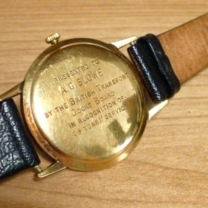
Before settling, I rejected two initial ideas. Note that I only ended up draft-shooting one of these ideas on my phone (pictured above), the other barely made it past a sketch in my notebook that thankfully, I will not be showcasing.

The sketched concept would have been a robot sculpture made of items I found on the street, bound together with a skeleton of steel wire. In the end I decided against this because it just wasn’t practical in the time that I allocated myself to complete this assignment, and while it would’ve been interesting from an artistic or sculptural perspective, it wouldn’t have showcased my developing skills as a photographer in any substantial way.

The concept shoot of the engraved watch I actually really, really love. The item itself is a treasured possession of mine, and thus wherein the problem lies… While it is technically a found item because I did find it in a charity shop, it was months before I even began attending university, and therefore doesn’t actually fit the criteria. Perhaps in another life.

I was interested in shooting this item purely because of the history it has. The watch is an expensive brand, custom engraved and given out to an employee in celebration of their long service. Perhaps I’m a sentimentalist, but the possible reasons it was left behind at a charity shop as opposed to being treasured by a family member intrigue me.

Thank you for reading.

Images In The Wild

For our first week task we were instructed to appropriate (take possession of) somebody else’s image, an image already out in the wild, such as in the work of Richard Prince, a man renowned for shamelessly taking other photographer’s images (be they professional or posting something as mundane as a selfie on Instagram) and repackaging them as his own work, be it by cropping or otherwise altering them, and then selling them for six to seven figure sums.

One particular piece of his struck a cord with me.


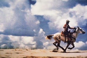
time-100-influential-photos-richard-prince-untitled-cowboy-82


“Untitled (Cowboy)” from 1989, a cropped and retouched Marlboro magazine advertisement.

I’m unsure why it struck me in the way it did, but I chose to use it’s concept as the basis for my own work here (further appropriating something in the process. Good, eh?). Taking a piece of advertising from an existing piece of media, and using that.

And here is my image…


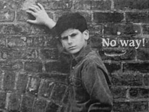
FullSizeRender 8


In the end, I found it in a 1993 issue of Fantastic Four Unlimited, published by Marvel comics and featuring a rather mundane story about the Hulk and the Thing having a bit of a punch-up.

I liked this image because upon taking it out of context, it implied way more than anything else I found. Something about it just jumped out and me, and that’s what I was looking for. The only thing I modified in my original smartphone capture was upping the contrast a little to compensate for 24 years worth of fading, and cropping out the majority of the ad (what you see is approximately an inch and a half across, and an inch down, of a full A4 ad).

This was quite a fun exercise for me, and I thoroughly enjoyed it. Though I absolutely do not advocate for the “appropriating” of somebody else’s work, regardless of artistic intent.